|
  
|
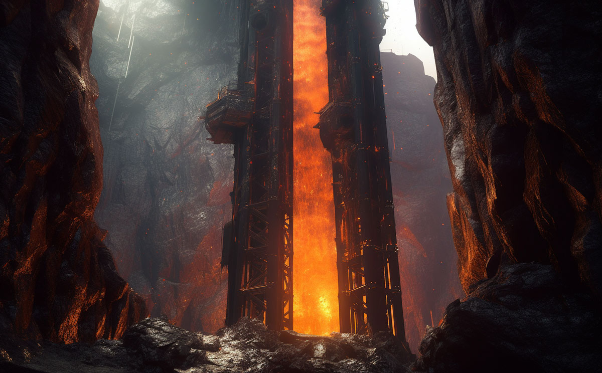
Supervolcanoes and Super EarthquakesSkeptoid Podcast #985 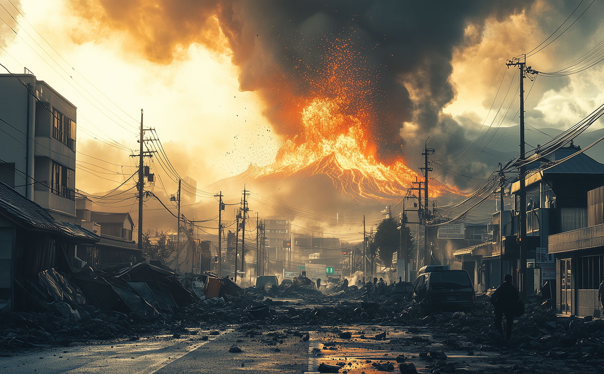 by Brian Dunning Today we're going to do the opposite of what most of the world's media does whenever earthquakes or volcanoes make the headlines. The usual treatment is to come up with terrifying and shocking predictions: scientists can't rule out that The Big One will hit tomorrow; scientists can't rule out that the Yellowstone Caldera will explode tomorrow. No, that would not be very Skeptoidy of us. Instead, we're going to take a more sober look at what kind of risk we humans actually do face from these two alarming natural disasters. Now obviously you're saying "Of course Brian's going to do an episode on major seismic events today, because National Richter Scale Day is this week. It is true. April 26th is indeed National Richter Scale Day, celebrating the birthday of Charles F. Richter (1900-1985). And the irony of this is that — as you may know — we no longer use the Richter scale! When he developed it in 1935, it was a pioneering logarithmic scale, meaning that each subsequent number represents 10 times as much energy released by the quake; i.e., a 4.0 earthquake is 10 times as powerful as a 3.0, and a 5.0 is 10 times as powerful as that. But it was based on California's geography and the seismographs that were available at the time. The way it was calculated did not accurately measure very large earthquakes, small earthquakes, or quakes that were far away. So in 1979, a new system was introduced called the Moment Magnitude Scale which, instead of just measuring shaking, takes into account the physical properties of the quake, including the local geology, the amount of slip, and the area of the fault that slipped. It also uses additional detail that modern seismographs collect that the Richter scale didn't. It can accurately represent any size quake. The numbers are the same: a 6.0 on the Richter scale is the same as a magnitude 6 quake; but using the Moment Magnitude scale is always going to give you a more accurate representation. So now that we understand the magnitude of earthquakes associated with the disastrous possibilities we're going to talk about today, we also have to clarify the difference between hazard and risk. A hazard is something that has the potential to harm you; a risk is the likelihood of that harm happening. For example, falling into the Sun would be a very hazardous place to be; but your risk of that happening is very low. A volcano could go off on a remote island in Antarctica, and though it might be the most violent explosion in history, it's not going to harm anyone or destroy any cities. So that's a hazardous volcano, but not a risky one. Assessing the risk of one of these events also considers the likelihood that it will occur in a certain time period. To do this we need volcanologists, seismologists, geologists, and geophysicists constantly measuring events, collecting data, and doing historical analysis. For earthquakes we also look at things like the building codes and the existing structures. Is it a place that can ride out larger quakes? If not, if the structures are old, that's going to increase the risk assessment. Things you're not likely to see in this episode are the media darlings, like the Yellowstone Supervolcano that "might kill us all tomorrow." Why not, since it is indeed active? Such articles, always in pursuit of sensationalism, portray the least likely events (e.g., a supereruption) and ignore what actually is continuing to happen there. These are small hydrothermal explosions, which average about one every two years; the potential for larger earthquakes around M7; and then much less likely is a lava flow. Considering the minimal potential for loss of life, none of these possibilities carries much risk. So now let's take a look at the top 10 riskiest volcanoes around the world — the ones people actually do need to pay attention to. These were easy because the hard work of identifying them has already been been done by the International Association of Volcanology and Chemistry of the Earth's Interior, which as part of the International Decade for Natural Disaster Reduction in the 1990s, came up with a list of sixteen so-called Decade Volcanoes. The danger to life from all of these, like all volcanoes, is from rapid flows of lava, lahar, or ash. The 1980 explosion at Mount St. Helens, which you may recall, was a lahar flow — nobody in the path had any hope of survival. These are the 10 riskiest:
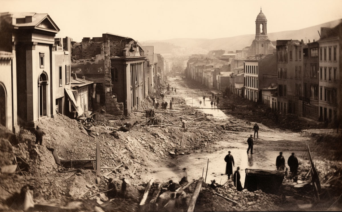
But the deadliest events in all of history have come not from volcanoes, but from earthquakes. In 1556, 830,000 people died in the Shaanxi Earthquake, and in 1976, 650,000 people died in the Tangshan Earthquake. Most of these died instantly, most from structure collapses, and most of the rest from landslides. But earthquakes can also trigger tsunamis, such as the Indian Ocean Tsunami that killed a quarter of a million people. All of these factor into determining how risky a particular fault zone is. But what we're not able to do is sort earthquake fault zones into a convenient Top 10 list like we just did with volcanoes. We know where a volcano is, but faults can be hundreds and hundreds of miles long. We generally have no idea where along a fault it might slip or how big or deep that might be. And a hundred other variables. About the best attempt to quantify earthquake risk is GEM, the Global Earthquake Model, a nonprofit, scientific, public-private partnership headquartered in Pavia, Italy. They produce all kinds of data products, all open source and free, including risk maps, hazard maps, software, viewers, data sets, models, everything earthquake. For our conversation today, I'm looking at their 2023 Global Seismic Risk Map. It basically shows the geographic distribution of the Peak Ground If that's the best the world's best can do, then it should tell you all you need to know about YouTubers and other Internet personalities who claim to be able to precisely predict earthquakes. If you need a refresher on how we know they cannot do this, then please check out Skeptoid #873 on Earthquake Prediction. Here's what we get from the GEM datasets. I'm going to give you five metrics, and the top six countries most at risk from each of the five. These are not projected damages from some hypothetical major quake; these are their average annual losses based on 100,000 years of simulations running on GEM's OpenQuake modeling engine:
It's interesting to look at the countries most at risk and compare them to the map, which is color coded by average annual loss of built-up area, from least to most. You've got Canada, Russia, Australia, Greenland, most of Africa, most of South America all showing the least loss. Why? It's not because earthquakes don't happen there; it's because there is very little built-up area in those relatively remote regions. It underscores the definition of risk. The world's worst earthquake or volcano could blow up in the middle of nowhere and nobody gets hurt because nobody's around. It's a very hazardous area, but it's also a very low-risk area. So as we'd expect, it's a very different picture when we look at the hazard map. The first thing we notice is that the Pacific Rim is lit up bright red, where the Pacific plate grinds up against the Australian and North American plates, and where the Arabian and Indian plates crush up against the Eurasian plate — all the world's biggest seismic hotspots. So don't let the tabloids frighten you. Any of these events is at an extremely low probability on any given day; and the places we're told are riskiest are not necessarily the same as the places that are the most hazardous. If it sounds like that's just mincing words, well, words matter.
Cite this article:
©2025 Skeptoid Media, Inc. All Rights Reserved. |